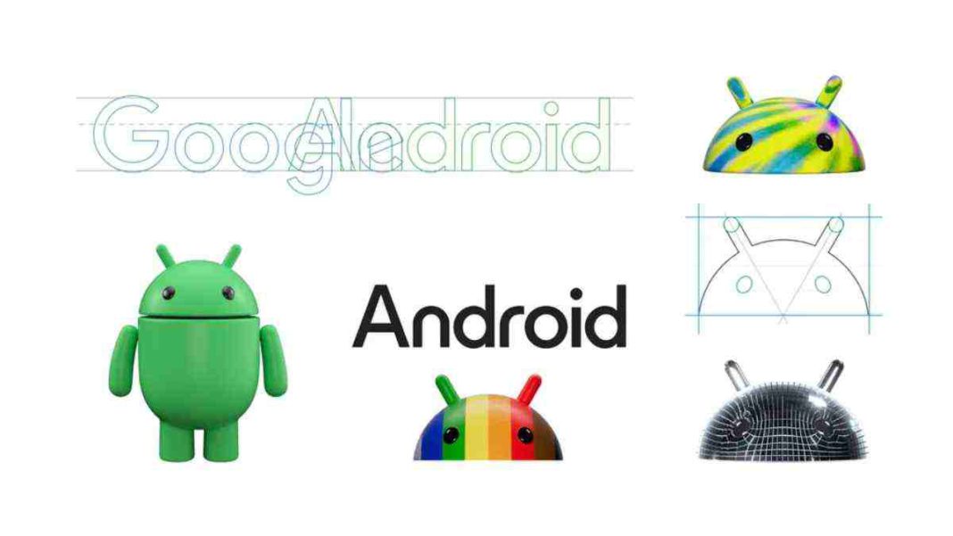
UNITED STATES: In a significant move to align with its core values of openness, iteration, and inclusivity, Google has given the iconic Android logo a stunning makeover.
The revamped logo draws inspiration from Material Design, and the most noticeable change is the transformation of “android” into “Android.” Additionally, the bugdroid, the beloved face of the Android robot, has undergone a dynamic transformation to better resonate with Android’s ever-evolving nature.
Android, the world’s most popular mobile operating system, has a staggering presence with over 3 billion devices worldwide.
Despite the allure of the iPhone, Android smartphones continue to dominate the market. Google’s decision to reimagine the Android logo reflects its dedication to evolving alongside the changing needs and aspirations of its users.
The previous major overhaul of the Android logo occurred in 2019, coinciding with the shift in naming conventions for Android versions.
Google had previously christened its Android versions with delectable dessert names, such as Marshmallow, Oreo, and Nougat. This time around, the update goes beyond aesthetics.
As Jason Fournier, director of Android Consumer Brand Management, explained, “Each time we overhaul our branding, we evaluate not only changing needs but also future goals. We know that people today want more choice and autonomy, and we want our brand to reflect Android: something that empowers people to create on their terms.”
The inspiration for the new logo is rooted in Material Design, a design language known for its adaptability and aesthetic appeal. The shift from “android” to “Android” is not just a matter of capitalization; it adds visual prominence to the brand, allowing it to stand harmoniously beside Google’s iconic logo.
“The new Android stylization more closely resembles the Google logo and achieves harmony between the two”, said Fournier, adding that “we’ve added more curves and personality unique to Android.”
One of the most striking updates is the transformation of the bugdroid, which serves as the Android robot’s identifiable face. This alteration has endowed the bugdroid with increased dimension and character.
“As a reflection of our brand, we wanted the bugdroid to look as alive as Android itself”.
According to Fournier in the official blog post, the robot’s full-body design has also been upgraded, enabling it to travel smoothly between virtual and real places, making it a versatile and dependable companion across many channels, platforms, and situations.
This transformation marks a significant step in Google’s ongoing journey to enhance the Android brand’s identity and ensure it remains reflective of the platform’s ethos.
As Android continues to evolve, these changes not only invigorate the logo but also reaffirm Google’s commitment to its users and the ever-growing Android community.
Also Read: Google Chat Boosts Cross-Platform Communication with Slack and Teams Integration


