INDIA: In the world of statistics, numbers can often paint a deceptive picture. One classic example that exposes the limitations of relying solely on statistical measures is known as Anscombe’s Quartet.
This Quartet of datasets, devised by British statistician Francis Anscombe in 1973, challenges our perception of data and highlights the importance of visual analysis.
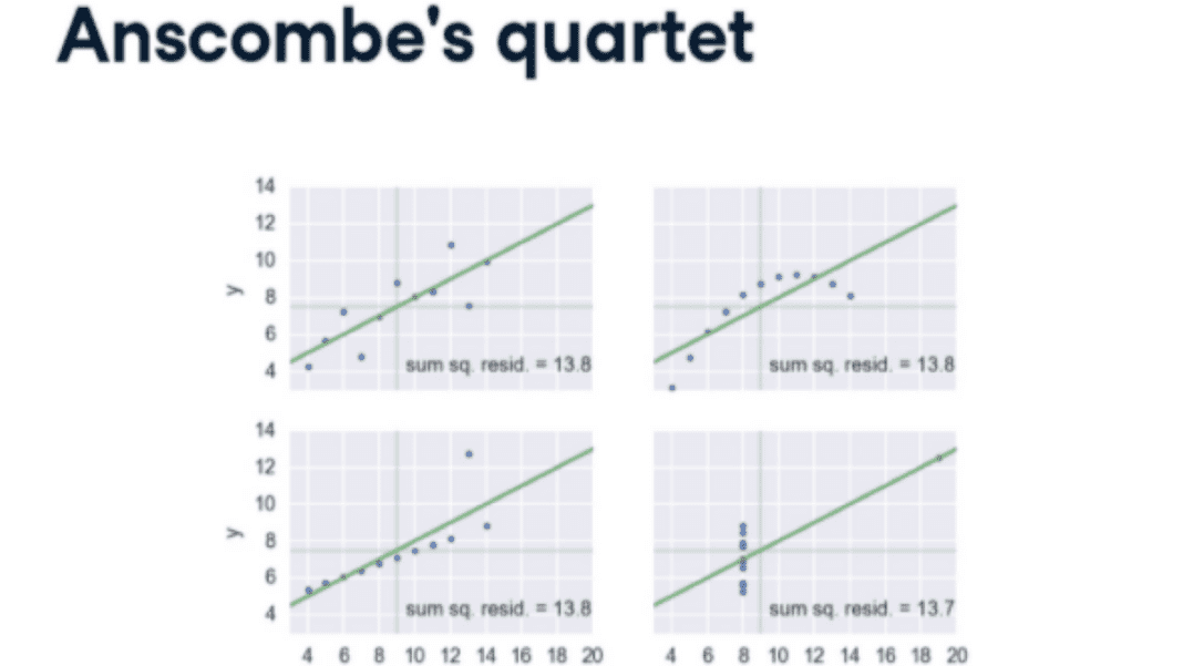
Anscombe’s Quartet consists of four distinct datasets with 11 data points. At first glance, these datasets appear to have similar statistical properties, with nearly identical means, variances, correlations, and linear regression parameters. However, when plotted, they reveal startling differences.
The power of Anscombe’s Quartet lies in its ability to demonstrate the dangers of relying solely on summary statistics without considering the underlying data distribution. Let’s explore each dataset in detail:
Dataset I: This dataset exhibits a perfect linear relationship between the x and y variables. A linear regression model would fit the data accurately, representing a clear cause-and-effect relationship.
Dataset II: This dataset appears to be a scatterplot, but it reveals a non-linear relationship upon closer examination. A linear regression model would yield an inaccurate representation of the data.
Dataset III: Here, we encounter an outlier significantly influencing the linear regression line. Removing this outlier would drastically change the summary statistics and the perceived relationship between the variables.
Dataset IV: In this case, we witness the impact of a single influential data point. It creates a high-leverage effect, pulling the regression line to fit it. This dataset showcases the potential pitfalls of relying solely on a linear regression model.
The main takeaway from Anscombe’s Quartet is that summary statistics alone can be misleading. Although the four datasets share similar statistical properties, we can only reveal their true nature through visual examination.
This prerequisite underlines the importance of data visualisation in understanding and interpreting data accurately. In today’s data-driven world, where complex statistical models and algorithms are prevalent, Anscombe’s Quartet serves as a reminder of the significance of critically analysing data beyond its summary statistics.
While numbers may convey a sense of certainty, they can often mask underlying complexities and patterns that only become evident through visualisation.
Data scientists, analysts, and researchers must embrace the power of visual representation to uncover the nuances and hidden insights within datasets.
By plotting and visualising data, we can better understand relationships, identify anomalies, and avoid falling into the trap of statistical deception.
Anscombe’s Quartet has become a cornerstone of statistical education, prompting discussions on the limitations of summary statistics and the necessity of visual exploration.
It highlights the need for critical thinking and scepticism when interpreting data, reminding us that statistical measures alone may not provide the complete story.
As we navigate the realm of data analysis, let Anscombe’s Quartet serve as a constant reminder to question, explore, and visualise our data.
By doing so, we can uncover the true narratives within the numbers and make more informed decisions based on a comprehensive understanding of the data.
Also Read: Russell’s Paradox: The Mind-Boggling Self-Referential Conundrum of Classic Mathematics


